Data interpolation and approximation
It is common in engineering to obtain a set of data points
 from an experiment or measurement and wish to obtain a function that can be used to represent the value of y for any value of x. This process is called data fitting. The function
 used to fit the data can be defined so that
 for each data point or the function f can be defined so that it merely “comes close to” the points where comes close to is defined in some mathematical way. If
 for each data point then f is called an interpolating function and if
 then f is called an approximating function.
In most cases of interest, data approximation is the preferred approach. The function used to fit the data points is often obtained from a theoretical model of the process being measured. Statistical variation in the data or the measuring instrument will lead to small deviations from the exact function that is describing the process. However, if data approximation is used then the theoretical function can be fitted to the data so it comes close to the measured data points.
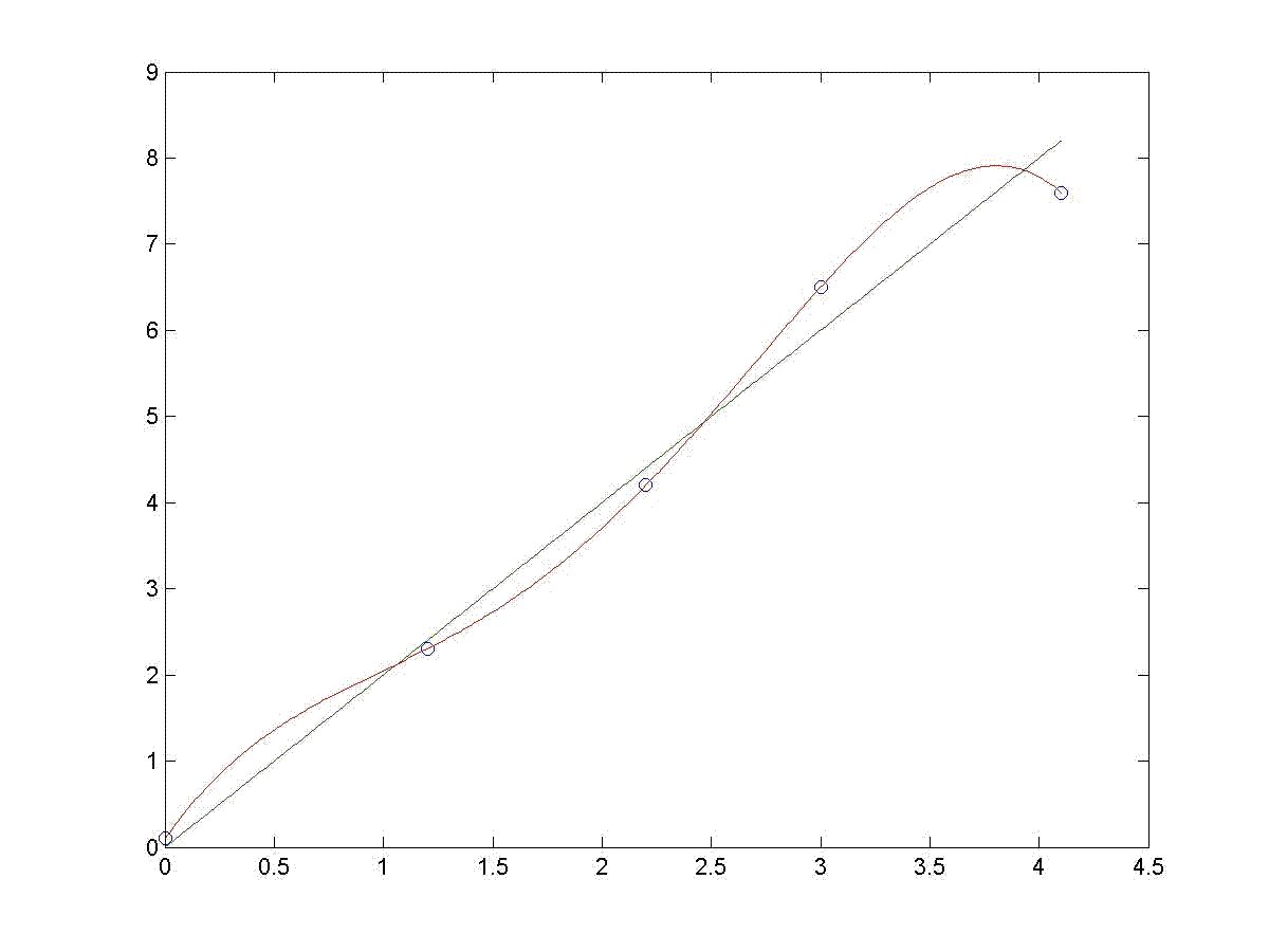
Suppose you are measuring a quantity that is expected to increase linearly with time and the measured data values are tabulated as follows.
| t | 0.0 | 1.2 | 2.2 | 3.0 | 4.1 |
|---|---|---|---|---|---|
| y | 0.1 | 2.3 | 4.2 | 6.5 | 7.6 |
From a theoretical perspective you expect the function to be

The data and this function are plotted below. Also plotted is a fourth degree polynomial that interpolates the data by passing through all five data points. It can be proven mathematically that a N-1 degree polynomial will interpolate N data points. Just because the polynomial passes through all data points, it clearly is not necessarily a good representation of the data. At each side of the plot the fourth degree polynomial deviates significantly from the expected general trend of the data. The statistical variation of the data from the expected linear trend is causing the higher degree polynomial to make sharp curves in order to pass through all data points, much the way a skier turns back and forth to pass through each gate when skiing in a slalom race. The theoretical straight line comes close to the data, but is this line the “best” linear function that comes close to the data? Or might another line drawn through the data be a slightly better representation? How can you tell?